
This image from “The Needs of the Many” is presented here by agreement between its creators, Iago Faustus and Dark Vanessa. Please do not copy or reproduce this image (except for fair use in good faith) without the consent of its creators. Thank you.
This is the new story?
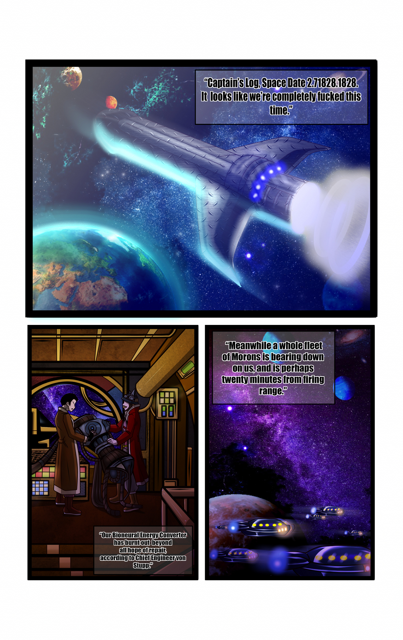
Suggestively shaped rocket ship, an engineer named after the act… Firing on all thrusters from page one, as it were.
Since you’re on page one I feel I can say this… You know the typeface and the way the letters are outlined does not make a very readable combination… Right?
I understand the issue, and I am certainly encouraging Dark Vanessa — in a way I hope is consistent with being a good creative partner — to go back toward more traditional comics lettering for the third story. As for this one, you’ll get relief shortly as we move at least toward black-on-white lettering for most balloons and caption boxes.
You can also, of course, right click and download to get a considerably larger version of the page.