For the first time since I started this site more than two years ago I am considering a design overhaul. I am hoping to achieve a couple of things.
- A wider main panel, with substantially wider image sizes, to make the Bespoke Art more visible and the Tales of Gnosis College more vivid and easier to read.
- Provide higher contrasts and make the site more visually interesting.
- Add a left-hand sidebar and a footer area, possibly with the aim of posting advertising. I still honor the ideals involved in amateur creation, and please make no mistake, I intend for the content here always to be free. But the costs of creating and promoting all this content are considerable, and I can do more here if I can recoup at least some of them. Think of it this way — earnings can be plowed back into the Erotic Mad Science project, and that will mean more art for everyone.
- Due notice of adult content. In a perfect world, I wouldn’t ever feel tempted to do this. But we don’t live in an ideal world. There are just too many people out there who can’t stand to see someone else having a good time, and I need to at least try to ward them off.
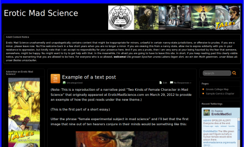
Nothing is set down in stone right now, but I do have a proposed draft site, using a customized version of Sayontan Sinha’s remarkably powerful and flexible WordPress theme Suffusion. Here’s a sneak peak:
You can click for larger. It’s set up with examples of different kinds of posts I do, as well as a sample page and a sample comic, and even dummy ads where I think they would be likely to appear. You don’t have to limit yourself to just the picture, though. It’s set up in a subdomain of its own and I invite you to head on over and take a look around. Let me know what you think, either by leaving comments here, there, or just getting touch with me directly. All sincere and non-abusive opinions will be very welcome.


An ability to increase font size? As I get older I find that capability sometimes useful.
I’m right with you there, with presbyopia setting in distressingly early in my case.
The existing proposed overhaul increases font size to 16 pt and I’m mulling larger.
Also some browsers allow you to increase font size with Ctrl+ (mine does) but unfortunately I can’t do this without increasing the size of the whole page, which is ungainly. I’ll look into the possibility of a better implementation of your suggestion.
Typically I find black backgrounds with white writing much harder on my eyes. I like the increased space in the middle though.